Elements of Art and Principles of Design Explained
Have you ever looked at a painting, a logo, or even a well-designed website and just felt that it works? There's a reason for that, and it's not magic. It's a deliberate language, and the key to speaking it fluently is understanding the elements of art and principles of design.
Think of it like cooking. The elements are your raw ingredients—the flour, sugar, and eggs. The principles are the recipe—the instructions on how to combine those ingredients to bake a perfect cake.
Jump To Section

Earn As You Learn
Earn 25% commission when your network purchase Uplyrn courses or subscribe to our annual membership. It’s the best thing ever. Next to learning,
of course.
The Building Blocks of All Visual Art
To really get a handle on creating (or just appreciating) strong visual work, you have to know what it's made of. These aren't just stuffy, academic terms; they're the practical tools that everyone from a classical painter to a modern UI designer relies on to build a composition, guide the eye, and stir emotion.
It all boils down to two core groups:
- The Elements of Art: These are the visual tools you have in your toolbox. They are the nouns of art—the actual "stuff" you see, like lines, shapes, and colors.
- The Principles of Design: This is what you do with that stuff. They're the verbs of art—the strategies you use to arrange the elements in a way that feels intentional and effective.
For instance, a photographer might use the element of color and apply the principle of contrast to make their subject leap out from the background.
Actionable Insight: The next time a design catches your eye—whether it's a movie poster or an app icon—try to name just one element (like texture) and one principle (like balance) you see at play. This simple habit will start to train your brain to see how an image was built, not just what it looks like.
Why This All Matters
Grasping the relationship between the ingredients and the recipe is everything. You can have the best ingredients in the world (the elements), but without a solid recipe (the principles), you'll end up with a mess on the canvas. Mastering both is what empowers you to create work that not only looks great but also communicates exactly what you want it to.
A fantastic place to begin is by getting comfortable with color theory for beginners. It's a perfect example of how a single element can be manipulated using different principles to create entirely different moods and effects.
In this guide, we’ll break down each element and principle one by one, using real-world examples and simple exercises to build your creative toolkit from the ground up.

Elements vs Principles A Quick Overview
To make this distinction crystal clear, here's a quick side-by-side comparison. Think of the elements as the "what" and the principles as the "how".
Ultimately, knowing the difference is what separates a random assortment of shapes and colors from a compelling, unified composition.

Exploring the 7 Essential Elements of Art
If you want to create powerful visual work, you have to know your ingredients. The elements of art are just that—the fundamental building blocks that artists and designers have been using for centuries. Think of them like the individual notes a musician uses to write a song. Each one is distinct, but when you combine them, you can create a masterpiece.
This isn't some new-age concept. The idea of core artistic elements has been around forever, though it was more formally defined in the 20th century. Today, we recognize seven key elements: line, shape, form, space, color, value, and texture. And the most basic of them all, the line, is one of humanity’s oldest forms of expression. We’ve found complex line engravings on prehistoric bones that are tens of thousands of years old.
Let's break down each of these tools and see how they really work.
Line: The Foundation of All Drawing
A line is so much more than a simple mark on a surface. It's the path of a moving point, the skeleton that gives a composition its structure. Lines can be thick or thin, straight or curved, jagged or smooth—and each one carries a different energy.
- Practical Example: A sharp, angular line in a comic book drawing feels aggressive or dynamic, while a soft, flowing curve in a landscape suggests peace and movement. In a portrait, the lines forming a frown instantly tell a story of sadness, while the clean, straight lines of a skyscraper convey order and stability.
Actionable Insight: Grab a pencil and paper. Now, try to draw three different emotions—joy, anger, and calm—using only one continuous line for each. Don't lift your pencil. Notice how the weight, speed, and direction of your line naturally change to express each feeling. It’s a simple exercise that proves just how much a single line can say.
Shape and Form: From Flat to Three-Dimensional
When a line loops around and connects to itself, it creates a shape—a flat, two-dimensional area with a clear boundary. We tend to see shapes as either geometric (like circles, squares, and triangles) or organic (like the free-flowing shape of a puddle or a leaf).
- Practical Example: Think about logos. The simple, triangular shape of the YouTube play button is universally understood, and the bold, circular Target logo is impossible to ignore. They are memorable because their shapes are clean and direct.
But what happens when a shape gets depth? It becomes a form. A flat circle becomes a sphere, a square becomes a cube, and a triangle can become a pyramid or a cone. On a 2D surface, artists create the illusion of form using tools like shading and perspective, which are directly tied to the element of value.
Actionable Insight: In industrial design, the sleek, rectangular form of a smartphone is designed to feel modern and efficient. On the other hand, the rounded, organic form of a handmade ceramic bowl feels personal and natural. Consider the forms of objects around you and the feelings they evoke.
Space: The Art of Emptiness
Space is all about the area in, around, and between objects. It's the unsung hero of composition, but it’s just as critical as the objects themselves. We typically talk about two kinds of space:
- Positive Space: This is the space taken up by your main subject.
- Negative Space: This is the empty air all around it.
A great artist knows that the empty parts of a canvas are just as important as the filled ones. Negative space gives your eyes a place to rest and can be used to create balance and define the main subject.
- Practical Example: The iconic FedEx logo is the ultimate example—the negative space between the 'E' and 'x' creates a perfect arrow, implying speed and forward motion. This clever use of space transforms a simple word into a powerful brand message.
Actionable Insight: Find an object in your room, like a chair or a lamp. Instead of trying to draw the object itself, try drawing only the shapes of the empty space around it. This exercise flips your brain's usual way of seeing and forces you to appreciate how negative space gives form to everything else.
Color: The Most Expressive Element
Nothing packs an emotional punch quite like color. It can instantly set a mood, grab your attention, and trigger a deep psychological response. To really get a handle on color, you need to understand its three main properties: hue (the pure color itself, like red), saturation (its intensity or purity), and value (its lightness or darkness).
For a deeper dive into one of the most powerful elements, check out this guide to Color Theory for Artists.
Warm colors like red, orange, and yellow feel energetic, passionate, and even aggressive. Cool colors like blue, green, and purple often feel calm, serene, or sometimes melancholic.
- Practical Example: It’s no accident that fast-food chains like McDonald's and Burger King use red and yellow. These colors are known to stimulate appetite and create a sense of urgency. A spa, however, will almost always use a palette of soft blues and greens to promote relaxation.
Value: Light and Dark in Composition
Value is simply the lightness or darkness of a color, running on a scale from pure white to solid black. It’s absolutely essential for creating depth, contrast, and mood. An image without a good range of values will look flat and lifeless.
- Practical Example: High-contrast images, with their bright whites and deep blacks, feel dramatic and bold, like in a classic black-and-white film noir. A low-contrast image, full of similar mid-range grays, feels much softer and calmer, like a foggy morning photograph. More importantly, it’s value that turns a flat shape into a believable three-dimensional form by creating highlights and shadows.
Actionable Insight: Take a black-and-white photo of something simple, like an apple. Now, try to sketch it, focusing only on recreating the full range of values you see. Find the brightest white highlight, the darkest black shadow, and at least three distinct gray tones in between. This trains your eye to see the world in terms of light, not just color.
Texture: The Way Things Feel
Finally, we have texture. This element refers to the surface quality of an object—how it feels, or how it looks like it would feel. Texture can be real (like the rough surface of a stone sculpture) or it can be implied (like a painter using clever brushstrokes to make a piece of silk look smooth and shiny).
- Practical Example: A painter might use thick, chunky dabs of paint to create a rough, energetic surface. A photographer might capture the glossy, smooth texture of still water to create a feeling of peace.
Actionable Insight: Look at modern web design. Designers often use subtle background textures—like a faint linen or paper grain—to add a sense of depth and tactility to an otherwise flat digital screen. A site for an organic food company might use a recycled paper texture to visually reinforce its brand identity.
Using the 7 Key Principles of Design
If the elements of art are your raw ingredients—your paint, clay, or pixels—then the principles of design are the recipe. They’re the proven techniques artists and designers use to arrange those ingredients on a canvas, screen, or page to create something that’s not just present, but powerful.
Think of it this way: anyone can splash paint (color) onto a canvas (space). But a true artist uses principles like balance and contrast to make sure that splash feels deliberate, guided, and emotionally charged. These aren't rigid rules you have to follow. Instead, they're flexible guidelines that help you organize the elements for maximum impact.
This system—which includes balance, contrast, emphasis, movement, pattern, rhythm, and unity—is the foundation of all visual communication. Honed over centuries and formally defined in 20th-century art education, these concepts are now applied everywhere, in every medium. For example, the principle of unity is absolutely vital in branding and UI design to create a consistent, trustworthy experience.
Let's break down each of these seven principles and see how they work in practice.
Balance: The Visual Weight of a Composition
Balance is all about giving your work a sense of stability. Every element you place—a shape, a block of text, an image—carries a certain visual weight. Balance is the art of distributing that weight so the entire composition feels grounded, not like it's about to tip over.
You can achieve this stability in a few different ways:
- Symmetrical Balance: Think of a mirror image. Elements on one side of a central axis are repeated on the other, like the wings of a butterfly. This creates a feeling of formality, order, and calm. The architecture of the Taj Mahal is a perfect example of this.
- Asymmetrical Balance: This approach is more dynamic and often feels more modern. It involves arranging different, unequal elements to create a felt sense of equilibrium. A single large, dark shape on one side can be balanced out by several small, light shapes on the other.
- Radial Balance: Here, all elements radiate outward from a central point, like the spokes of a wheel or the petals of a daisy. It’s a great way to naturally draw the eye toward the center and create a strong focal point.
Actionable Insight: The next time you're putting together a presentation slide, play with asymmetrical balance. Instead of centering everything, try placing a large image on the right two-thirds of the slide and your main headline in the top-left third. You’ll find it creates a much more engaging and professional layout.
Contrast: Highlighting Differences for Impact
Contrast is what makes a design "pop". It’s the principle of creating sharp, noticeable differences between elements to grab attention and build visual interest. You can create contrast with just about any element: light vs. dark, smooth vs. rough textures, large vs. small shapes, or warm vs. cool colors.
Without enough contrast, a design feels flat, boring, and hard to read. Good contrast makes text more legible and instinctively guides the viewer's eye to the most important parts of the image.
- Practical Example: A "call to action" button on a website is a classic use of high contrast. A bright orange "Buy Now" button placed on a blue background is nearly impossible to miss because the colors are opposites, creating maximum visual energy.
Emphasis: Creating a Focal Point
Closely linked to contrast, emphasis is the technique of making one part of a design stand out as the most important thing. This is your focal point—the very first place you want the viewer's eye to land.
You can create emphasis in several ways:
- Isolation: Place an object all by itself, surrounded by negative space.
- Placement: The center of a composition naturally demands more attention.
- Contrast: Make the focal point dramatically different in color, size, or shape from everything around it.
Actionable Insight: A word of caution: a design with too many points of emphasis is just confusing. A strong composition has a clear visual hierarchy. When designing a poster, decide on the single most important piece of information—the band name, the date, the venue—and use emphasis to make it the star. All supporting details should take a backseat.
Movement and Rhythm: The Path of the Viewer's Eye
Movement is the path a viewer's eye follows through a piece of art. It’s a journey you, the artist, create, often guided by lines, edges, and shapes that lead the eye from the focal point to other areas of interest in a specific order.
Rhythm is what you get when you repeat one or more elements to create a feeling of organized movement, much like a beat in music. Different types of rhythm create different moods:
- Regular Rhythm: An element repeats at a consistent, predictable interval, like bricks in a wall. This feels calm and steady.
- Flowing Rhythm: This is created by curvy, organic lines that suggest the movement of wind or water. It feels natural and graceful.
- Progressive Rhythm: Elements repeat, but they change slightly each time—think of a series of circles that gradually get smaller. This creates a sense of a journey or progression.
Pattern and Unity: Creating Cohesion
Pattern is simply the uniform repetition of any element of art. You see it everywhere, from the repeating floral designs on wallpaper to the geometric tiles on a floor. Patterns are great for making a surface feel more active and visually rich.
While pattern is about repetition, unity is the broader principle of making all the different parts of your design feel like they belong together. When a piece has unity, it feels complete and harmonious, not like a jumbled collection of random parts.
You can build unity through:
- Proximity: Grouping related elements close to one another.
- Repetition: Using the same colors, shapes, or textures throughout the piece.
- Alignment: Arranging elements along a common line or edge to create a clean structure.
Practical Example: A well-designed brand is a masterclass in unity. Take a company like Apple. They use the same clean fonts, a limited color palette (mostly white, black, and gray), and generous negative space across their website, products, and packaging. This repetition creates a powerful, unified experience that you instantly recognize.
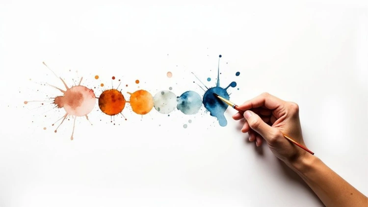
This map shows how fundamental elements like line, color, and shape act as the building blocks for any creative work.
The image makes it clear that the principles are what give those core components structure and meaning.

Putting It All Together: Elements and Principles in Action
To truly grasp how this works, it helps to see how a specific principle organizes specific elements to achieve a goal. This table breaks down a few examples of that relationship in action.
As you can see, the elements are the "what" and the principles are the "how". By learning to intentionally combine them, you gain complete control over your composition's message and feel.

Deconstructing Masterpieces to See Theory in Action
It’s one thing to know the definitions of the elements of art and principles of design, but the real magic happens when you see them working together in the wild. Think of it like being an art detective. When you learn to deconstruct a visual—whether it's a classic painting or a modern app icon—you start to see the hidden language that makes it work.
This practice is the key to training your eye. You’ll move past just seeing an image and start to truly understand its construction.
Let's kick things off by putting one of the most famous paintings in the world under the microscope to see how these concepts build a powerful, emotional experience.
Classic Case Study: Vincent van Gogh’s The Starry Night
At first glance, The Starry Night just feels like a raw explosion of energy. But what, exactly, creates that feeling? Van Gogh was a master of using the most basic elements to achieve incredibly complex results.
- Element in Focus - Line: The entire painting is dominated by thick, swirling lines. The sky isn't just a flat blue backdrop; it’s a living vortex of curved, expressive brushstrokes. These lines aren't static—they’re pure, unbridled energy.
- Principle at Play - Movement and Rhythm: Those energetic lines are the engine driving the principle of movement. Your eye can’t help but follow the circular paths across the sky, which creates a powerful, pulsating rhythm. Even the dark cypress tree on the left uses sharp, upward-flicking lines to pull your gaze from the earth toward the heavens, connecting the two halves of the composition.
- Element in Focus - Color: Van Gogh’s choice of a limited color palette—mostly deep blues and brilliant yellows—is far from random. It's a strategic decision.
- Principle at Play - Contrast and Emphasis: The glowing yellow of the stars and moon creates a stunning contrast against the dark, moody sky. This high-contrast pairing establishes multiple points of emphasis, making the celestial bodies feel explosive and intensely bright. They immediately become the undeniable focal points.
Actionable Insight: Van Gogh didn't just paint a night sky; he used line and color to build a composition that feels alive with movement, rhythm, and a powerful sense of awe. Next time you view a painting, try to isolate one element and one principle. Ask yourself: "How did the artist use [Element] to achieve [Principle]?" This simple question unlocks a deeper appreciation.
Modern Case Study: The Apple Logo
Now, let's jump from a complex, emotional painting to a symbol of minimalist design: the Apple logo. It’s a perfect example of how the same fundamentals apply even when the goal is simplicity and clarity. The design is so effective precisely because it expertly manipulates just a few key ideas.
- Element in Focus - Shape and Space: The logo is simply an organic shape (the apple) with another simple shape (the bite mark) removed. The real genius is in its use of both positive and negative space.
- Principle at Play - Balance and Unity: Even with a chunk missing from one side, the logo feels perfectly stable and grounded. This is a masterful use of asymmetrical balance. The gentle curve of the bite is visually counterweighted by the opposing curve of the leaf, creating a sense of equilibrium that makes the whole design feel unified and complete.
The Science Behind the Art
This isn't just creative intuition; the strategic use of elements and principles is something we can actually observe and measure. Computational analysis of art shows how artists have tactically manipulated these building blocks for centuries to achieve visual complexity and balance.
In a massive study analyzing nearly 140,000 paintings, researchers were able to quantify attributes like spatial ordering and entropy. They discovered clear patterns corresponding to different historical styles, proving a data-driven link between the principles artists use and the impact their work has. You can learn more about how visual complexity in art is studied and measured.
Whether you’re looking at a centuries-old masterpiece or a modern corporate logo, the lesson is the same. Every effective design is a successful marriage between its ingredients (the elements) and its recipe (the principles). By learning to spot these connections, you can start building more intentional and impactful compositions in your own work.

Applying These Concepts to Your Creative Work
Theory is one thing, but the real magic happens when you start doing. You can read about the elements of art and principles of design all day, but true understanding—the kind that becomes second nature—only comes from putting that knowledge into practice. This is where we bridge the gap between learning and creating.
The goal isn't to cram every single principle into every piece you make. That would be exhausting! Instead, it’s about developing an instinct for what works. Think of it like building a visual toolbox. These exercises are designed to help you get your hands dirty and start using those tools to make intentional, confident decisions in your own work.
For Photographers: A Challenge in Balance
Street photography is an amazing training ground for composition because it’s so unpredictable. Your challenge: head out and capture a single, compelling image that demonstrates asymmetrical balance.
Forget placing your subject smack in the middle. Instead, position them off to one side. Now, look for something else in the scene to act as a counterweight. It could be a brightly lit sign, a deep shadow, or even a smaller group of people on the opposite side of the frame. The trick is to create a photo that feels dynamic and interesting, yet still stable and deliberate—not just accidentally lopsided.
Actionable Insight: Start seeing the world in terms of visual weight. A large, dark building on one side of your shot can be beautifully balanced by a small, bright yellow taxi on the other. Training your eye to spot this weight is the key to mastering asymmetrical composition.
For Graphic Designers: A Study in Contrast and Unity
Time to design an event poster, but with a few creative handcuffs. This exercise forces you to rely on two foundational principles, contrast and unity, by stripping away all the bells and whistles.
Here are your constraints:
- Shapes: You can only use circles and squares. No other shapes allowed.
- Colors: Pick just three colors to work with (black or white can be one of them).
- Text: Include the essentials: a headline, a date, and a location.
Actionable Insight: Use scale to create high contrast, making some shapes huge and others tiny. Use your limited color palette to draw the eye to a clear focal point. Finally, use repetition and careful alignment to tie all the elements together, creating a sense of unity. It’s a powerful lesson in how much you can achieve with so little.
For Painters: A Foundation in Value
Want to dramatically improve your paintings before your brush even touches the canvas? Start with value sketches. A value sketch is just a quick, small drawing that maps out the lights and darks of your composition.
Find a reference photo or set up a simple still life. Grab a pencil and make three to five small thumbnail sketches. The crucial part? Ignore color and detail completely. Just focus on breaking the scene down into its main shapes and assigning each one a value: light, medium, or dark.
Actionable Insight: This simple exercise helps you solve huge compositional problems—like balance, flow, and where the viewer’s eye will go—before you’ve invested hours into the final piece. It guarantees your painting will have a strong, dramatic foundation built on value.
Common Questions About Art and Design Rules
Diving into the elements of art and principles of design always stirs up a few common questions. Think of these concepts as a creative compass, not a rigid set of laws. Knowing when to follow them—and when to chart your own course—is what truly elevates your work.
Let's clear up some of the most frequent sticking points so you can start making more intentional and confident creative choices.
Which Element or Principle Is Most Important?
This is a classic question, and the honest answer is: it completely depends on what you’re trying to achieve. There's no single "master" rule that trumps all others.
- Practical Example: For a graphic designer working on a minimalist logo, shape and balance are probably king. The goal is a clean, stable mark that feels solid and trustworthy. A landscape painter, on the other hand, might pour all their energy into mastering color and space to create a convincing illusion of depth and atmosphere.
But if you’re looking for the best all-around starting point? Focus on value—the relationship between light and dark. A strong grasp of value is the bedrock for creating form, mood, and compelling contrast in any medium you choose.
Is It Okay to Break the Rules of Design?
Not only is it okay, it's often essential. The most powerful and memorable works of art frequently break the "rules" on purpose. They do it to create tension, to surprise the viewer, or to provoke a specific emotional reaction.
Actionable Insight: The trick is to know the rules inside and out before you decide to shatter them. When you understand what makes a composition feel perfectly balanced, you gain the power to create an intentionally unbalanced one for a jarring, dynamic effect. Master the fundamentals first, then you can start experimenting with real purpose.
How Do These Ideas Apply to Digital Art?
These concepts aren't just for painters and sculptors; they’re more critical than ever on a screen.
For a UI/UX designer, unity and pattern are the tools they use to build websites that feel intuitive and easy to navigate. For someone creating a social media graphic, emphasis and contrast are what stop the endless scroll and grab a viewer's attention in a crowded feed.
Actionable Insight: The color theory you see in a polished Instagram grid directly shapes the brand’s entire vibe. The sense of balance in a TikTok video is what makes it feel professional and watchable instead of just chaotic. These timeless fundamentals are the foundation of all great visual communication, regardless of the device it’s viewed on.
Ready to put all this theory into practice? At Uplyrn, we have a whole range of courses built to help you master these creative skills for real-world projects. Start your journey today and build a portfolio that truly stands out.


Leave your thoughts here...
All Comments
Reply