Graphic Design in Photoshop: A Practical Guide
Getting your hands dirty with a new design in Photoshop is exciting, but hold on a second. Before you even think about picking a font or a color palette, the single most important thing you can do is set up your workspace. A little prep work here makes the entire creative process smoother and faster.
Jump To Section

Earn As You Learn
Earn 25% commission when your network purchase Uplyrn courses or subscribe to our annual membership. It’s the best thing ever. Next to learning,
of course.
Setting Up Your Photoshop Workspace for Design
Think of a well-organized workspace like a chef's perfectly prepped kitchen—everything you need is within arm's reach, letting you get into a state of flow without hunting for tools. It’s no surprise that professionals have been leaning on this software since 1988 to build incredible visuals. Today, it still commands a massive 36-42% of the graphic editing market.
Of course, before you dive in, it’s always a good idea to make sure your machine is up to the task. A quick look at this hands-on guide to Photoshop system requirements can save you a lot of headaches from lag and performance issues later on.
Starting with the Perfect Canvas
Every single project starts in the 'New Document' window. This is ground zero, where you define the DNA of your design. Getting these settings right from the get-go is critical, and it all boils down to where your design will ultimately live.
- Designing for Screens (Web & Social Media): If you're creating an Instagram post (1080x1080 pixels) or a website banner, you need to set your Color Mode to RGB and your Resolution to 72 DPI (Dots Per Inch). Screens use Red, Green, and Blue light to display images, and 72 DPI is the long-standing standard for sharp on-screen viewing without creating bloated file sizes.
- Prepping for Print: Working on a business card or a physical flyer? You absolutely must use CMYK Color Mode and set the Resolution to 300 DPI. Printers use a mix of Cyan, Magenta, Yellow, and Black inks, so CMYK is essential for accurate color reproduction on paper. The much higher 300 DPI resolution ensures your final printed piece is crisp and clear, not pixelated.
Customizing Your Panels for Peak Efficiency
Let's be honest, Photoshop's default layout can feel overwhelming. The real key to a fast workflow is personalizing it to show only the panels that matter for graphic design. You can click, drag, and dock panels to build a command center that works for you.
At a minimum, we always recommend keeping the Layers, Properties, and Character panels visible. These are your bread and butter for managing composition, making adjustments, and handling all things typography.
To help you get started, we've put together a quick rundown of the panels we consider non-negotiable for any serious design work.
Ultimately, the goal is to build a space that feels intuitive and removes friction, letting you focus on what really matters: creating.
Actionable Insight: Once you get your panels arranged just right, save that layout! Go to Window > Workspace > New Workspace and give it a memorable name like "My Design Hub". The next time you open Photoshop, you can instantly load your custom setup and get straight to work.

Working with Layers and Masks Like A Pro
If the canvas is your stage, then layers are your actors. I can't stress this enough: mastering Photoshop's layering system is the single most important habit you can build. It's what separates a flexible, editable masterpiece from a flat, unchangeable image that sends you into a panic when a client asks for a "small" revision.
Think about building a design for a social media ad. You'll have the background, a product image, the main headline, a logo, and a call-to-action button. Each of these elements absolutely must live on its own separate layer. This separation is your superpower. It gives you complete control to move the logo without nudging the text, or to swap out the background color without touching anything else.
The Power of Non-Destructive Editing
A non-destructive workflow is your safety net, and it's a habit every pro swears by. Instead of permanently altering an image—like hitting it directly with a brightness effect—you use things like adjustment layers. These are special layers that sit on top of your image layer, applying effects like brightness, contrast, or color balance without ever damaging the original pixels underneath.
Practical Example: You have a product photo that looks a little dark. Instead of going to Image > Adjustments > Brightness/Contrast, go to the bottom of the Layers panel and click the half-black/half-white circle icon. Select Brightness/Contrast from the list. Now you have an adjustment layer you can tweak, hide, or delete at any time, leaving your original photo completely unharmed.
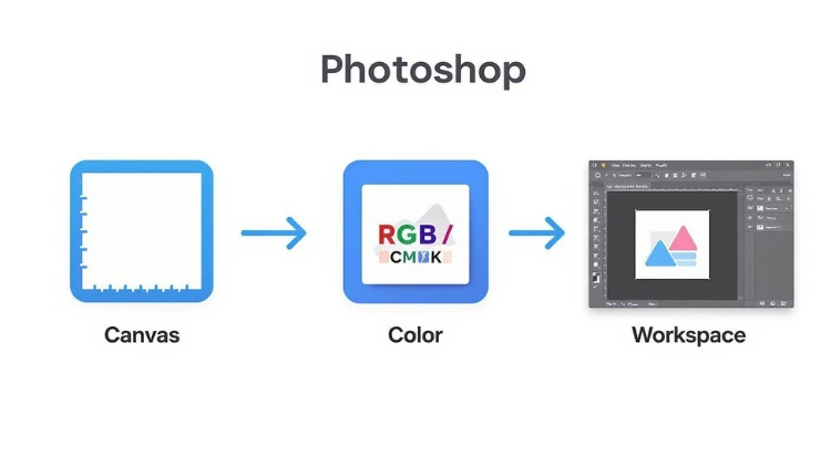
This visual guide breaks down the initial setup, from creating your canvas to organizing the workspace. Getting these fundamentals right is the foundation for managing your layers effectively down the line.
As you can see, the basic settings for your canvas, color, and workspace directly influence how efficiently you can work with more advanced tools like layers and masks.
Demystifying Layer Masks
Layer masks are where the real magic happens, but they're also a classic stumbling block for beginners. The best way to think of a layer mask is as an invisible stencil that controls what you can see on its layer. It's an unbelievably powerful tool for blending images, creating complex cutouts, or isolating specific parts of a photo.
For example, when you need to make precise selections, like giving an object those perfect smooth rounded corners in Photoshop, masks give you the control and flexibility you need.
It all boils down to one simple rule:
- White reveals: Painting with a white brush on a layer mask makes that part of the layer visible.
- Black conceals: Painting with a black brush makes that part of the layer transparent, hiding it from view.
Practical Example: You're trying to blend a photo of a mountain range into a photo of a dramatic, cloudy sky. You'd put the mountain layer above the sky layer and add a layer mask to the mountains. Then, using a soft, black brush on the mask, you'd paint over the sky area in the mountain photo. This "erases" it, letting the cloud layer below show through seamlessly.
One of the most common tasks where layers and masks are indispensable is learning how to remove a background from a picture cleanly. Using a layer mask instead of the Eraser Tool means your changes are always reversible. If you accidentally erase a chunk of your subject, you just switch your brush to white and paint it right back in. That's the kind of control you need to produce professional work.
Bringing Your Creative Ideas to Life with Key Tools
Okay, you've got your workspace dialed in and you're comfortable with how layers work. Now it's time for the fun part—actually creating something. Let's get into the core tools that will take your ideas from inside your head to the canvas.
Think of these as your digital pencils, pens, and brushes. You'll be reaching for them on pretty much every single project, so getting to know them is non-negotiable.
The first one that trips people up but is absolutely essential is the Pen Tool. Don't let it intimidate you. Unlike a freehand brush, the Pen Tool gives you insane precision by creating clean vector paths using anchor points and curves. It's the gold standard for crisp, scalable logos, custom icons, or any design that needs to be perfectly clean.
Crafting Perfect Shapes and Paths
Practical Example: Let's say you're designing a minimalist logo for a new coffee shop—just a simple, stylized coffee bean. With the Pen Tool, you'd click to place your anchor points around the bean's outline. To create a curve, you click and drag. This pulls out handles that let you control the bend. You can create the entire shape with just a few precise clicks and drags, resulting in a perfectly smooth vector object.
The beauty of this is that it’s a vector. You can shrink that bean down for a tiny business card or blow it up for a massive storefront sign, and it will stay perfectly sharp. No pixelation, ever.
This flexibility is a huge part of modern graphic design. Even physical products like custom t-shirts start with these foundational vector skills. If that's your goal, this course on designing shirts in Canva and Photoshop breaks down how these tools translate to real-world products.
Check out the main drawing tools, including the Pen Tool and its cousins, the Shape Tools.
You can see how each tool has a specific job, from creating rigid geometric forms to flowing, custom lines. It's a complete toolkit for building visuals from the ground up.
Building with Shapes and Typography
While the Pen Tool handles custom work, the Shape Tools (Rectangle, Ellipse, Polygon, etc.) are your workhorses for building the basic structure of your design. Making an Instagram post? You'll probably grab the Rectangle Tool for a background color block and the Ellipse Tool to crop a product image into a perfect circle.
Next up is the Type Tool, and it's so much more than just typing. This is where you dive into typography—the art of making text look good. Photoshop gives you incredible control over the little details that separate amateur from pro:
- Kerning: Fine-tuning the space between two specific letters.
- Tracking: Adjusting the spacing across an entire word or sentence.
- Leading: Changing the vertical space between lines of text.
Actionable Insight: For a big, bold headline, try slightly decreasing the tracking. It pulls the letters together and makes them feel more unified and powerful. For body text, do the opposite—slightly increase the leading to give it room to breathe and improve readability. These tiny adjustments make a world of difference.
Adding Artistic Flair with Brushes
Finally, there's the Brush Tool. This is where you add that human touch. It's not just for digital painting; it’s perfect for adding subtle textures, creating soft glows and lighting effects, or painting on a layer mask with precision.
With "handcrafted" and "textured grain" aesthetics being so popular, the Brush Tool has never been more important. Learning techniques like how to create seamless textures can really elevate your work, and Photoshop's brush engine gives you everything you need to add that organic, tangible feel to your digital designs.
When you start combining these tools, you'll quickly realize you can build almost anything you can imagine.
Applying Design Principles Directly in Photoshop
Having powerful tools at your fingertips is one thing, but knowing why you're using them is what separates good design from great design. This is where the core principles of graphic design come into play. It’s about moving beyond just knowing what a tool does to truly understanding how to create a specific emotional or visual impact.
Concepts like visual hierarchy, balance, and color theory aren't just abstract rules you learn in a textbook. They are practical, actionable guidelines you can—and should—apply directly within your Photoshop projects. By being intentional with size, color, and placement, you create designs that don't just look good but also communicate a clear message.
Establishing a Clear Visual Hierarchy
Visual hierarchy is all about controlling the viewer's journey through your design. You get to decide what they see first, second, and third. This is absolutely crucial for any graphic, whether it’s a web ad or a social post, because it ensures your main message lands instantly.
Practical Example: You're designing a promo graphic for a sale. The product image should be the star. Make it the largest element. Use a vibrant color adjustment layer to make it pop. Your headline ("50% OFF") should be the next largest, followed by your smaller call-to-action button ("Shop Now"). This guides the eye naturally from the product to the offer to the action.
Here are a few go-to techniques for building hierarchy:
- Scale: The simplest trick in the book. Make important elements bigger.
- Color and Contrast: Use bright, bold colors for key elements like a "Buy Now" button to make them jump off a more muted background.
- Placement: Our eyes are naturally drawn to things at the top or center of a composition. Use that to your advantage.
Achieving Balance and Harmony
Balance gives your design a sense of stability and structure. When a composition feels off-balance, it can come across as chaotic or just plain unprofessional. Photoshop’s guides and grid systems (View > Guides > New Guide Layout) are your best friends here, helping you align everything with precision.
You’re generally working with two types of balance:
- Symmetrical Balance: Think of it as a mirror image. Elements are mirrored on either side of a central axis. This creates a formal, stable, and often traditional feeling.
- Asymmetrical Balance: This is where things get more interesting. Elements aren't mirrored, but their visual weights are balanced. For instance, a single large object on one side can be balanced by several smaller objects on the other. It feels much more dynamic and modern.
Actionable Insight: For a quick balance check, squint your eyes while looking at your design. This blurs out the details and lets you see the overall visual weights. If one area feels overwhelmingly heavy or empty, you know it's time to make an adjustment.
Using Color Theory in Your Workflow
Color isn't just filler; it's a powerful tool that evokes emotion and sets the entire tone of a design. Instead of just guessing what looks good, you can lean on Photoshop's built-in tools to simplify the process.
The Adobe Color Themes panel (Window > Extensions > Adobe Color Themes) is a fantastic resource for exploring and applying professional color palettes directly to your project. It lets you build schemes based on proven rules like complementary (opposite colors for high contrast) or analogous (adjacent colors for a harmonious feel).
You can dive deeper into how to embrace the 8 essential elements of graphic design, where color plays a starring role. By grounding your creative choices in these time-tested principles, you’ll be on your way to consistently producing more effective and impactful designs.
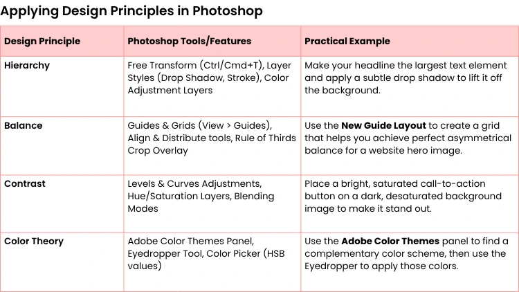
To bring this all together, here’s a quick-reference table showing how you can apply these principles using specific Photoshop features.
Think of this table as a cheat sheet. When you feel stuck, refer back to it to connect a design principle you're struggling with to a specific tool that can help you execute it.
Exporting Your Designs for Web and Print
You’ve poured hours into creating the perfect design, but the job isn't done yet. How you package and deliver that file is just as critical as the design itself. Getting the export settings wrong can completely undermine all your hard work, making your brilliant design look amateurish in the wild.
The path you take depends entirely on one simple question: is this for a screen or a printer?
We touched on the core differences when we set up our document—color mode and resolution. For web, you're living in an RGB world at 72 DPI. For anything destined for ink and paper, it's CMYK and a sharp 300 DPI. But the final gatekeeper of quality is the file format you choose.
Preparing Files for the Web
When you're exporting for digital spaces—think social media graphics, website banners, or email headers—you're balancing two competing goals: crisp visuals and tiny file sizes. A beautiful image that takes forever to load is a liability.
Our go-to tool for this is still Photoshop’s classic "Save for Web" dialog (File > Export > Save for Web (Legacy)). It’s an oldie but a goodie for a reason. It gives you a fantastic side-by-side preview, letting you fiddle with the settings and instantly see how you're trading quality for file size.
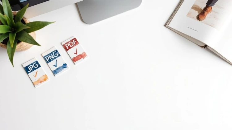
Here’s a quick rundown on the formats you'll use 99% of the time:
- JPEG (Joint Photographic Experts Group): This is your workhorse for photos and complex images full of color and gradients. JPEGs use "lossy" compression, which is a fancy way of saying it intelligently discards a little bit of data to shrink the file size. A quality setting between 60-80% is usually the sweet spot where you get a small file without a noticeable drop in quality.
- PNG (Portable Network Graphics): Reach for a PNG anytime you need a transparent background. This is essential for things like logos or icons that need to sit cleanly on top of other elements. PNGs use "lossless" compression, meaning they keep every single pixel of quality, but the trade-off is a larger file size.
- GIF (Graphics Interchange Format): While less common for static images these days, GIFs are still the king of simple, looping animations. They're also great for graphics with very few colors, like a flat-color logo.
Getting Your Designs Print Ready
Exporting for print is a whole different ballgame. Forget about file size; your number one priority is preserving every last drop of quality. Your goal is to hand over a file that a professional printer can work with, no questions asked.
Before you even think about exporting, do a final pre-flight check. Proofread everything. Double-check that your resolution is at least 300 DPI and that you've converted your document to the CMYK color mode to avoid any nasty color surprises.
If you're considering printing your own work, this guide on how to make art prints at home is a fantastic resource for getting started.
Actionable Insight: Always send a flattened copy to the printer. Save a copy of your file first (File > Save As). Then, in the new copy, go to Layer > Flatten Image. This merges everything into a single layer, preventing headaches with missing fonts or weird layer effects on the printer's end. Never flatten your master working file!
For professional printing, you'll be dealing with these formats:
- PDF (Portable Document Format): This is the undisputed industry standard. A high-quality PDF locks in all your vector data, text, and images exactly as you intended. It’s the most reliable and foolproof way to send your work to a print shop.
- TIFF (Tagged Image File Format): Another fantastic option for top-tier quality. TIFFs use lossless compression, so you get zero quality degradation. Use TIFFs for high-end photography or archival print work where absolute fidelity is a must.
Nailing your export settings is the final, crucial step that ensures your design looks just as professional in the real world as it did on your screen.
Your Common Photoshop Design Questions Answered
As you start getting your hands dirty with the tools and ideas in this guide, you're bound to run into a few questions. It happens to everyone. Let's tackle some of the most common stumbling blocks we see designers face, so you can keep your momentum going.
Can I Do Vector Graphic Design in Photoshop?
This is a big one. While Photoshop is famous for its pixel-pushing (raster) power, it's actually got some pretty solid vector tools built right in. You can absolutely create and tweak vector shapes using the Pen Tool, the dedicated Shape Tools, and even the Type Tool.
Anything you create this way lives on a vector layer, meaning you can scale it up to the size of a billboard or shrink it down to a tiny icon with zero loss in quality. This makes it great for things like logos or interface elements.
However—and this is a big "however"—if you're planning a project that's heavily vector-based, like a complex logo system or a multi-page brand style guide, you'll be better off in Adobe Illustrator. It’s the industry standard for a reason. Most pros use both programs together, often creating the core vector pieces in Illustrator and then bringing them into Photoshop to add textures, lighting, and other raster effects.
What’s the Most Important Thing to Learn First?
If you only take one piece of advice from this entire guide, make it this: master the Layers panel. We can't stress this enough.
Learning how to properly use layers, layer masks, and adjustment layers is the absolute foundation of a professional, non-destructive workflow. This single concept is what separates the beginners from the pros. It's the key to working flexibly and efficiently.
Actionable Insight: Get in the habit of naming every single layer. Instead of Layer 1, Layer 2, Copy of Layer 2, use descriptive names like Background Image, Headline Text, and Logo. When your document has 50+ layers, this simple habit will save you an incredible amount of time and prevent costly mistakes.
Think of it this way: instead of slapping a Brightness/Contrast filter directly onto your photo (and permanently changing its pixels), you create a new adjustment layer above it. If a client comes back and says the effect is too strong, you just tweak the settings on that layer or delete it completely. Your original photo remains perfectly intact. That kind of flexibility is non-negotiable.
How Do I Choose the Right Color Settings?
Choosing your color mode is one of those critical decisions you have to make right at the start of a project. Getting it wrong can lead to some major headaches and disappointing results down the line.
The choice all comes down to where your final design will be seen.
- RGB (Red, Green, Blue): This is your go-to for anything that will be viewed on a screen. Think websites, social media posts, digital ads, app interfaces, or videos. Screens create color by emitting light, and they do it using combinations of red, green, and blue pixels.
- CMYK (Cyan, Magenta, Yellow, Key/Black): Pick this mode for any design destined for physical print. We're talking business cards, brochures, posters, packaging—anything that involves putting ink on paper. Printers use these four ink colors to mix and create the final image in a subtractive process.
Practical Example: You design a flyer on your screen in RGB mode using a brilliant, electric blue. It looks amazing. But when you get the flyers back from the printer, the blue looks flat and dull. This happened because the printer's CMYK inks can't physically reproduce that exact vibrant blue created by your screen's light. To avoid this, always design for print in CMYK mode from the start (Image > Mode > CMYK Color).
Ready to turn your creative vision into a professional skill? Uplyrn offers expert-led courses that guide you through every aspect of graphic design, from foundational principles to advanced techniques. Join a community of learners and start building your future today. Explore our courses here.


Leave your thoughts here...
All Comments
Reply