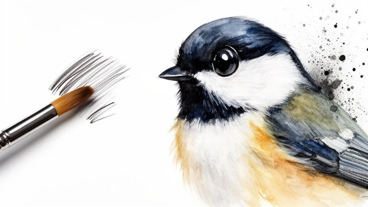
Painting Birds in Acrylic: A Guide to Lifelike Artwork
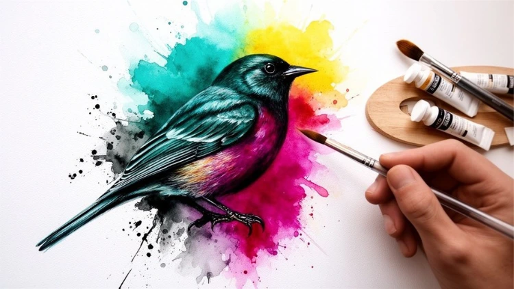
When you're painting birds, the real magic happens when you capture their personality—the delicate fluff of a chickadee's chest or the sharp, intelligent glint in a crow's eye. Getting these details right starts long before your brush ever touches the canvas. It begins with choosing the right tools for the job.
Your materials can either be your greatest ally or your biggest frustration. Let's make sure they're working for you.
Jump To Section

Earn As You Learn
Earn 25% commission when your network purchase Uplyrn courses or subscribe to our annual membership. It’s the best thing ever. Next to learning,
of course.
Choosing Your Acrylic Painting Essentials
Before we even think about sketching that cardinal, we need to talk supplies. It's no surprise that acrylics are a powerhouse in the art world; their versatility is just what we need for capturing the intricate details of birds. In fact, according to Data Insights Market, the global acrylic paint market is projected to hit USD 1.5 billion by 2025.
This popularity comes from acrylic's unique nature: it dries fast but gives you just enough time to blend. This makes it perfect for both broad washes of color and the fine-feathered details that bring a bird to life.
Brushes and Surfaces Make a Difference
Your brush is simply an extension of your hand. For painting birds, a few key shapes will become your best friends. A tiny round brush (size 0 or 1) is your secret weapon for that perfect, crisp highlight in an eye, while a filbert (a flat brush with a rounded tip) is a dream for smoothly shaping the curves of a bird's body.
Just as important is what you're painting on. While standard stretched canvas is a common choice, its weave can sometimes absorb the paint and soften your details.
For the crisp, fine lines essential to bird art, we highly recommend trying a gessoed panel. The smooth, rigid surface keeps the paint sitting right on top, which means every tiny stroke and vibrant color stays exactly where you put it. This makes rendering those delicate feather barbs so much easier.
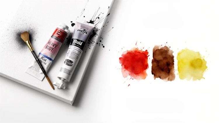
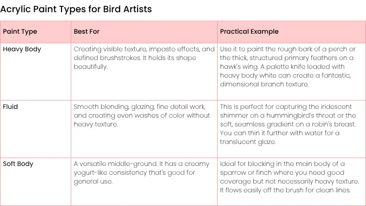
The Great Paint Debate: Heavy Body vs. Fluid
Your choice between heavy body and fluid acrylics will dramatically affect your process. They aren't just "thick" and "thin" paints; think of them as specialized tools for different effects.
Below is a quick breakdown to help you decide which paint consistency is right for your project.
Ultimately, you don't have to choose just one. Most artists keep both on hand.
- Actionable Insight: For a songbird painting, use heavy body paint (like Titanium White mixed with a little Yellow Ochre) to build the bird’s form and a bit of texture. Then, switch to fluid acrylics (like Cadmium Red and Yellow) for the smooth, fiery orange of its belly. The combination creates a dynamic contrast in texture.
Crafting Your Composition and Initial Sketch
Before you even think about mixing colors, the success of your bird painting is often decided in the first few minutes—right in the initial sketch. This isn't just about getting the bird's shape right; it's your first real chance to give the piece life and tell a story.
A great sketch is the blueprint for a dynamic painting. Where you place the bird, the direction it's looking, the flow of the branch it's on... these choices make the difference between a simple illustration and a piece that pulls the viewer in.
Designing a Dynamic Layout
We've all seen paintings where the subject is just plopped down in the dead center. It's fine, but it can feel a bit static, a bit too posed. An easy way to create a more engaging layout is by using the rule of thirds.
Just imagine your canvas has a tic-tac-toe grid drawn over it. The idea is to place your bird—or its most important feature, like its eye—at one of the four points where the lines intersect. This immediately creates a more natural and visually appealing balance.
Let’s say you’re painting a goldfinch perched on a thistle.
- Instead of centering it, place the bird's head near the top-right intersection.
- Let the thistle stalk sweep diagonally up from the bottom-left corner toward the top-right.
- Most importantly, have the bird look into the open space on the left side of the canvas. This simple trick creates breathing room and a sense of anticipation, as if it's about to take flight or sing.
If you ever feel stuck for ideas on layout, spend some time looking at professional wildlife wall art. You'll quickly see how other artists use composition to create mood and movement.
Simplifying Anatomy into Basic Shapes
Bird anatomy looks incredibly complex, we know. All those feathers and tiny details can be overwhelming. The secret is to ignore them at first. Instead, break the bird down into simple, manageable shapes.
- Actionable Insight: Think like you're sculpting with a pencil. For a chickadee, start with a large oval for the body and a smaller, overlapping circle for the head. Add a simple triangle for the tail and two thin lines for the legs. This helps you lock in the proportions and posture before getting bogged down in detail.
Once you have those basic forms lightly sketched, you can connect them with smooth, flowing lines to define the bird’s silhouette. Only then should you start indicating the larger feather groups, like the wing coverts or the primary flight feathers. This skill of simplifying complexity is fundamental, and it's a technique we also cover in this guide on essential techniques for portrait sketching.
Transferring Your Sketch Accurately
So you've perfected your sketch on paper. Now, how do you get it onto your canvas without smudges or distorted proportions? For this, the grid method is an artist's best friend—it's a classic for a reason.
- Start by drawing a light grid over your paper sketch (1-inch squares work well).
- Next, draw a corresponding grid onto your canvas with a light graphite pencil or a watercolor pencil. If your canvas is larger (e.g., 16x20) and your sketch is on 8x10 paper, your canvas squares will be 2 inches each.
- Now, just focus on copying your drawing one square at a time from the paper to the canvas.
This method forces you to focus on one small section at a time, ensuring your final drawing on the canvas is a perfect, proportional match to your original sketch. It gives you a clean, confident foundation to start laying down paint.
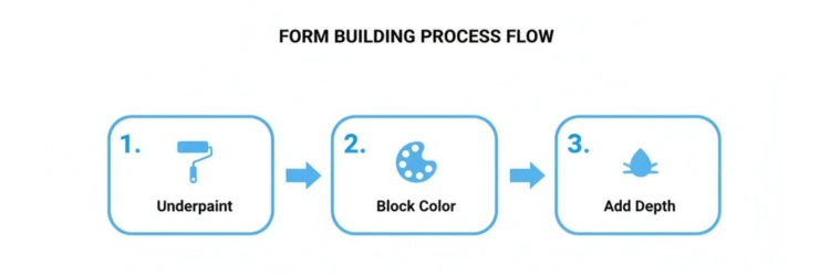
Building Form with Underpainting and Color Blocking
Okay, your sketch is down, and now for the fun part—actually slinging some paint. This is where your bird starts to feel less like a flat drawing and more like a real, three-dimensional creature. We're not worried about tiny feather details yet. Instead, we're going to build a solid foundation using an underpainting and then block in the main colors.
Think of an underpainting as your value map. It’s a quick, monochrome layer that tells you where your lights and darks will live. Grab some burnt umber, thin it out with water to the consistency of tea, and just focus on establishing the shadows. Getting your values right from the start is a total game-changer for creating realistic depth.
This whole process of building up form can be broken down into a few key stages, even before you start thinking about the fine details.
You create that initial value structure, lay down your basic colors, and only then do you start to carve out the real depth. It makes the final detailing so much easier.
Blocking In Your Bird's Main Colors
Once that underpainting is dry to the touch, it’s time to block in your colors. This is exactly what it sounds like: applying flat, solid shapes of the bird's main hues right on top of your value sketch. Don't even think about blending or textures. The only mission here is to get the basic, local color down in all the right places.
Let's imagine we're painting a blue jay. Here is an actionable plan:
- First, mix Ultramarine Blue with a touch of Mars Black and fill in its crest and the dark "necklace" around its throat.
- Next, mix a vibrant Cerulean Blue for the main feathers on its back and wings.
- Finally, use Titanium White mixed with a tiny bit of Payne's Gray for the chest and belly areas to create a subtle off-white.
Right now, your painting should look like a bold, graphic poster of a blue jay. That's perfect. You've just created a solid color foundation that will make adding details and rich textures in the next steps feel a lot more intuitive. If you want a deeper dive into picking and mixing your foundational colors, check out this guide that explains how colour works in art.
Mixing Colors and Building Richness
Even at this early stage, you should start thinking about your shadows and highlights in terms of color, not just value. Don't just reach for black and white to darken or lighten your base colors. You'll get much richer, more believable results by mixing.
- Practical Example: For that blue jay's shadows, instead of adding black, mix a bit of its complementary color—Burnt Sienna—into your Cerulean Blue. This will create a much more natural-looking dark tone. For highlights, mix in a tiny bit of white and a touch of Phthalo Green to give the blue a vibrant, sunlit feel.
Having a good grasp of an essential color mixing chart for miniature painting can be incredibly helpful for figuring out these complex hues on the fly.
Did you know the acrylic paints market is projected to hit USD 6,361.11 million by 2035? It’s a huge market with lots of options. Many pros love heavy body acrylics for their buttery texture. On the other hand, Open acrylics, which were valued at USD 13,934.89 million in 2024, give you a much longer working time. That extra time is a lifesaver for the kind of careful layering and blending we do in avian art.
Mastering Feather Details and Lifelike Textures
This is where your bird’s personality really begins to emerge. Once you have the form and base colors blocked in, the next step is creating feathers and textures that feel real. So many tutorials just tell you to "paint a bunch of small lines" but that's a shortcut to a flat, unconvincing bird.
True realism comes from understanding that feathers are three-dimensional structures. They have softness, they have sharp edges, they overlap. We need to move past simply drawing on top of our paint and start using specific brush techniques to actually build that texture. Let's break down a few of the go-to methods for different kinds of feathers.
Replicating Soft and Downy Feathers
For those fluffy, almost cotton-like feathers you see on a bird's chest—think of a chickadee or a robin—the dry brushing technique is your absolute best friend. It’s perfect for creating that delicate, broken texture that reads as "soft".
Here's the actionable approach to use:
- Grab a stiff-bristled brush. An old, slightly frayed filbert brush is actually perfect for this.
- Load it with a very small amount of paint (e.g., Titanium White).
- Wipe nearly all the paint off on a paper towel. You want the brush to seem almost completely dry.
- Now, lightly drag or skim the brush over the bird's chest area. The paint will only catch on the high points of the canvas weave and previous paint layers, creating a beautiful, scumbled effect.
Practical Example: Try this on a chickadee's white cheek patch. Use Titanium White over your gray underpainting, and you'll instantly see that signature fuzzy texture appear. It's a fantastic example of how a solid grasp of the elements of art and principles of design, especially texture, can really make your work sing.
Painting Sleek, Overlapping Feathers
On the other hand, you have the sleek, structured feathers on a duck's wing or a crow's back. They are defined and orderly, so we need a totally different technique. For these, you can rely on short, crisp strokes using a small, flat brush.
- Actionable Insight: For a duck’s wing, start with a dark base color (like a mix of Prussian Blue and Burnt Umber). Let it dry. Then, using a small flat brush, layer slightly lighter strokes (your base mix plus a little white) over it, following the curve of the wing. Finally, use just the edge of the brush to add even lighter strokes (more white added to the mix) just on the tips of the feathers. This three-step layering process builds incredible depth and realism with minimal effort.
Capturing the Magic of Iridescence
Iridescent feathers, like the shimmering purples and greens on a starling, can seem intimidating. The secret isn't a special "shiny" paint. It’s all about layering transparent colors, a technique called glazing, to create that amazing color-shifting look.
Let's imagine we're painting a starling's sheen. Here's how to do it:
- First, lay down a solid base of Mars Black or a very dark, rich purple.
- Next, mix a tiny bit of Phthalo Green with a generous amount of clear acrylic medium (like a gloss medium). You want this glaze to be very transparent, like stained glass.
- Lightly brush this green glaze over parts of the black base where the light would hit.
- Do the same thing with a transparent purple, like Dioxazine Purple, in other areas, letting the two glazes overlap in places.
The light travels through these transparent layers, hits the dark base, and reflects back, creating that signature shimmering effect that seems to change as you look at it from different angles.
The Eye: A Window to Realism
You can paint the most beautiful feathers in the world, but if the eye is dead, the whole bird will feel lifeless. A bird's eye is almost always a dark, glossy orb with a single, tack-sharp highlight.
- Actionable Insight: Start by painting the eye with a solid, rich Mars Black. Let it dry completely—don't rush this part. Then, take the very tip of your smallest round brush (a size 0 or 2/0), load it with a tiny dot of pure Titanium White, and carefully place that highlight. Its placement is everything. Position it at the 10 o'clock or 2 o'clock position to mimic light coming from above. That one tiny dot of light is the final touch that breathes life into your entire painting.
Creating Depth with Backgrounds and Lighting
You’ve painted a beautiful bird, but does it look like a sticker slapped onto a canvas? The background and lighting are what will lift your painting from a simple study into a living, breathing scene. They set the mood, tell a story, and make your bird feel like it truly belongs in its world.
The key is to make the background support your subject, not shout over it. A great background makes the bird the undeniable star of the show.
Designing a Background That Makes Your Bird Pop
One of the oldest tricks in the book—and one of the most effective—is to use color theory to push your subject forward. A background filled with cool, muted tones will make a warm-colored bird leap off the canvas.
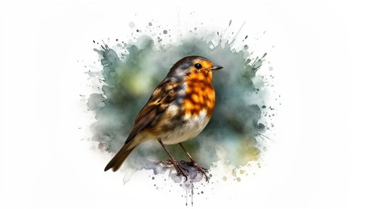
- Practical Example: If you’re painting a robin with its vibrant, fiery orange breast, try placing it against a backdrop of soft, cool greens and blues. Mix Sap Green with a little Payne's Gray and a lot of white for a muted, misty green. That simple contrast will make the robin's Cadmium Orange chest feel electric.
Another fantastic technique to use all the time is creating a soft-focus background, just like the shallow depth of field you see in professional photography. The easiest way to get this effect is with a wet-on-wet technique:
- Lightly dampen the background area with a clean brush dipped in water or clear acrylic medium.
- Loosely blend in your background colors (like muted greens and blues) while the surface is still wet.
- Use a large, soft brush to gently sweep over the blended areas. The edges will naturally soften and blur, creating that beautiful, out-of-focus look.
A bird's environment is part of its story. It’s no surprise that as more people learn to paint from home, they want to create these realistic scenes. In fact, the global acrylic paints market is set to grow to an incredible USD 165,784.03 million by 2031, partly because of this booming interest in DIY art and wildlife painting. You can dive deeper into these trends and their impact on art culture by checking out the full report.
Using Light to Carve Out Form
Light is your secret weapon for making a flat shape look three-dimensional. When you establish a single, strong light source, you create clear highlights and shadows that perfectly define the bird’s anatomy. This is how you turn a simple shape into a believable, rounded creature.
Before you even start, ask yourself: where is my light coming from? Is it the harsh, direct sun from overhead? Or maybe a soft, gentle light coming from the side? Your answer will determine exactly where your highlights pop and your shadows fall.
Add Drama with Dappled Light
One of the absolute favorite techniques for adding instant realism is painting dappled sunlight. Think of a bird perched just under a leafy tree, with patches of bright light breaking through the canopy. It’s a magical effect and easier to achieve than you might think.
Here's an actionable plan:
- First, paint the bird and its perch as if they are mostly in shadow. This means using darker, more muted versions of your base colors (e.g., add a little Burnt Umber to your main colors).
- Let that layer dry completely. Then, mix a warm, bright yellow like Cadmium Yellow Light with a bit of Titanium White.
- Using a small, crisp brush, paint sharp-edged shapes of light onto the bird’s back, head, and the branch it's on, following the form of the bird.
These little pockets of bright light immediately create the illusion of a leafy canopy just out of frame. It’s this dance between light and shadow that truly breathes life and a sense of place into your acrylic bird painting.
Applying Finishing Touches and Varnishing Your Art
You’ve poured hours into your painting, and now it’s time for that final, crucial step. Protecting your finished acrylic bird painting isn’t just about preservation; it's about bringing your artwork to its full potential. This is where a good varnish comes in, and your choice will have a huge impact on the final look.
A gloss varnish is the go-to for making colors sing. If you've painted a tropical macaw, for instance, a gloss finish will make its plumage look incredibly rich and saturated, almost like it's still wet. It just makes every bright hue pop right off the canvas.
On the other hand, a matte varnish offers a very contemporary, non-reflective finish. This works beautifully for paintings with a softer, more subtle mood—think of a sparrow in muted morning light. The matte surface eliminates glare, giving the piece a quiet, almost velvety feel. And if you can't decide, a satin varnish sits perfectly in the middle, offering a gentle sheen that’s not too reflective but still gives the colors a nice boost.
How to Apply Varnish Flawlessly
Applying varnish can feel a little stressful—it's the last step, and you don't want to mess it up! But with a bit of care and patience, you can get a perfect, streak-free finish every time. The single most important thing is to let your painting fully cure, not just feel dry to the touch.
Depending on how thick you've applied the paint and the humidity in your room, this can take anywhere from 3 days to a full week or even longer.
- Actionable Insight: Rushing to varnish is the number one mistake artists make. If you apply it over paint that hasn't fully cured, you'll trap moisture. This creates a cloudy, milky film under the varnish that, unfortunately, is permanent. It's worth the wait! Test a small corner with a damp cloth; if no color lifts, you're likely good to go.
Once you're confident the paint is completely cured, here’s the step-by-step process:
- Lay your painting perfectly flat on a table in a clean, dust-free space. Give the room a good vacuum an hour beforehand to let dust settle.
- Grab a wide, soft-bristled brush that you use only for varnishing. A 2-inch flat wash brush works well for most canvas sizes.
- Pour a little bit of varnish into a separate, clean container. Never dip your brush directly into the main bottle, as this can introduce dust and contaminants.
- Apply a thin, even layer with long, smooth strokes all going in the same direction (horizontally, for example).
- Let that first coat dry completely (usually 2-4 hours). Then, apply a second thin coat in the opposite direction (vertically) to ensure you haven’t missed any spots.
And finally, don't forget to add your signature! With your painting now beautifully finished and protected, you can think about how to display it. A simple frame can do wonders, and if you’re thinking about sharing your work more widely, you might find this guide on how to make art prints at home really helpful.
Common Questions About Painting Birds in Acrylic
No matter how long you've been painting, birds present their own unique set of challenges with acrylics. Let's walk through some of the questions we hear most often from fellow artists and talk about some practical solutions.
The biggest hurdle is almost always the paint drying too fast. It's the classic acrylic problem. The absolute go-to solution is a stay-wet palette. This simple piece of kit keeps your custom color mixes fresh for hours, sometimes even days.
- Actionable Insight: You can make a DIY stay-wet palette. Place a few folded, damp paper towels in a shallow, airtight plastic container. Lay a piece of parchment paper on top. Squeeze your paints onto the parchment paper—the moisture from below will keep them workable.
You can also keep a small spray bottle handy to give your palette a light mist of water when things start to feel a bit tacky. For those longer painting sessions, mixing a few drops of slow-dry medium directly into your paint on the palette will give you a much more forgiving working time.
Fixing Mistakes and Painting Details
So, how do you tackle those impossibly small details, like the glint in an eye or the fine edge of a beak? It all comes down to having the right tools and a steady hand. For this kind of precision work, use a size 0 or 2/0 round brush.
- Actionable Insight: For getting super crisp lines, rest the heel of your painting hand on a dry part of your canvas or use a mahl stick (a simple stick with a padded end). This creates a stable pivot point and gives you way more control for that crucial highlight in the eye.
The great news is that acrylics are incredibly forgiving. If you make a mistake—and we all do—just let it dry completely. Once it’s dry, you can paint right over the top to fix the shape or adjust the color. It's one of the best things about the medium.
And yes, you can absolutely mix different brands of acrylics. The main thing to watch for is their consistency. If you combine a thick, heavy body paint with a much thinner, fluid one, the texture will change. It’s always a good idea to test your mixes on a scrap piece of paper first to make sure you're getting the result you're after.
At Uplyrn, we believe that mastering a new skill like painting comes from great instruction and hands-on practice. Explore our courses and start bringing your visions to life.


Leave your thoughts here...
All Comments
Reply